Okta Studio
Illustration, Brand Strategy, Visual Identity, Branding, Verbal Identity
Okta has a new look: creative, bold, experimental. We are Okta, we are problem solvers and we have arrived!
THE CHALLENGE:
Over the last two years, Okta has undergone significant transformations, including restructuring the partner's board and expanding our range of services beyond our core business, branding. Therefore, the challenge for this in-house project was to rebrand every aspect of our identity.
THE SOLUTION:
Just like in any other project, we started with the strategy: dedicating time to restructure our brand strategy and define our identity moving forward. This journey took us through a rebranding process, culminating in vibrant new visual and verbal identities. Expect a burst of color, playful stickers, personalized illustrations, and a dynamic logo that promises to leave a lasting impression.

Rebranding is a challenge for any company, it is an even bigger challenge when we do it in our own company.
Okta Branding was strictly a branding studio. When life happened and chaos emerged, the two owners (that's us) remaining went through a long self-reflecting journey to figure out what we wanted. We felt like Okta was a little uptight for us. We needed a little push to get our motivation going, we needed something that represented our good spirit and our love for bold design and fun copy, as well as showing our new services.


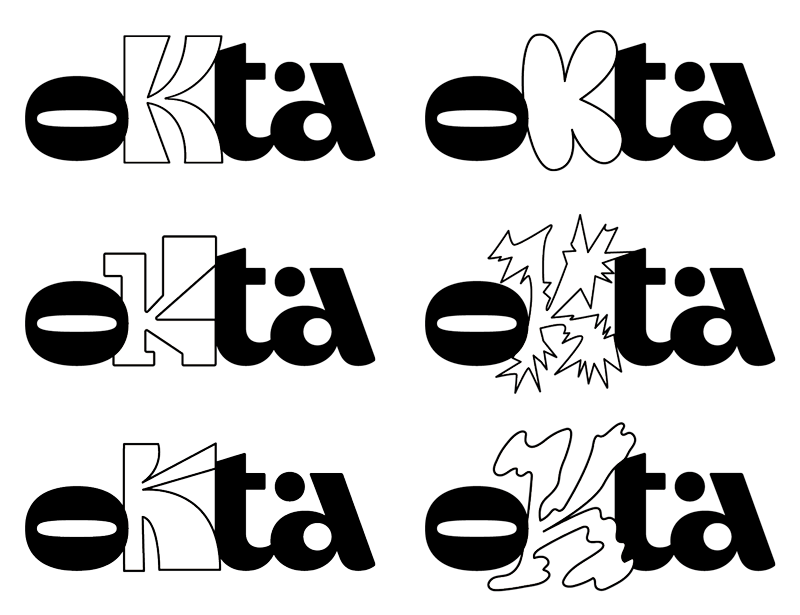
We wanted our logo, our colors, and our graphics to represent the enthusiasm and versatility that is us. The main question for this project was: why not? So, a logo with different K's? (After all, K is the standout letter in Okta.) Why not? Stickers? Why not? A bright green? Why not? We embrace it all, we are creative, we are experimental, we are problem solvers, we are Okta and we have arrived.
We also wanted to bring one of the things we love most in the creative universe: illustration. But how to do this in a way that is versatile, fun, and at the same time "easy" to apply? Our answer was STICKERS.
Our stickers are a combination of various feelings and sensations we experience in our daily lives, paired with brand-motivational phrases (kind of like coaching but with our twist). For us, they bring even more authenticity and allow us to "play" with the elements in each new piece and layout we create.


Copywriting: Paula Rego and Luísa Fantinel
Designer: Luísa Fantinel
Illustration: Luísa Fantinel
Type Designer: Harbor Type
Brazil | 2024
