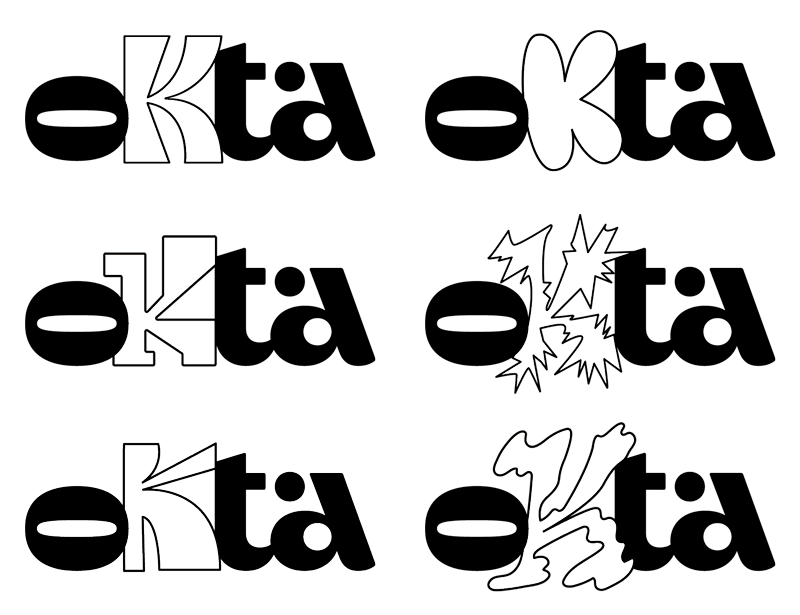
Visual identity is a systematic set of graphic elements that express the intangible attributes of a brand. Vision is one of the main senses we use to perceive the world around us, so building a strong and coherent visual identity is essential for our consumers to clearly understand what we want to convey.
Do you think your visual identity is working? Well, let's see if it will pass in these 8 attributes, adapted from the book "How to Create Visual Identities for Successful Brands" by Gilberto Strunck.
Compatibility
The visual identity needs to align with the essence of your brand. It's no use developing a super innovative logo if your business is not bold and disruptive. We have a project that is a great example of this: the first image corresponds to the old logo of Hype, a lively, cheerful, and fun animation studio. Does this logo convey any of these characteristics? Not. Our role was precisely to create a colorful and animated visual identity that reflected its laid-back essence.


Personality
Are the visual elements that make up your visual identity system distinctive, unique, and proprietary? The visual identity should express the personality of your brand and differentiate it from competitors. Consider the first Pepsi logo. Isn't it easier to remember Coca-Cola than Pepsi when looking at it? Use distinctive and unique visual elements instead of trying to resemble your competitor.

Durability
Will your graphic brand still be current in 5 years? A lasting visual identity doesn't follow trends or fads but presents a solid and timeless graphic universe. Think about Coca-Cola. Notice how the logo has been updated over time but has retained the same visual elements that are now so distinctive to the brand.

Conciseness
A good logo should be easy to remember. A concise visual identity system features visual elements that facilitate brand recall and identification. Look at the first Apple logo from 1976. Do you think it would be as memorable a symbol as the iconic bitten apple?

Legibility
It goes without saying that a logo needs to be legible, right? A visual signature should feature easily readable typography and allow for reductions. Can you guess which brand had this logo? Chevrolet! See how challenging it was to read its name and how it became even worse in reduced versions.

Applicability
Is your visual identity versatile enough to be applied to different materials and media without losing its strength? Look at the logo applications we developed for Dia de Romaria. It needed to work even in relief on a soap.

Graphic Quality
Does the brand's graphic universe exhibit visual harmony? Are the elements well-constructed and free from communication noise? Look at the evolution of the Fiat logo: it started with intricate arabesque shapes that visually cluttered the graphic mark and now is simple and direct.

Extension
Does the visual identity system have graphic elements that support the construction of the brand's visual universe? Extension means being able to apply supporting elements, well beyond the logo, and still maintain a clear identification of your brand. Look at the image below. Do you know what brand this is? The wave and the red color unmistakably reveal Coca-Cola, without even needing its logo. Coca-Cola does this masterfully.

So, did your visual identity pass the test? Are you building a coherent visual universe to develop a strong brand?
